
Hi! I'm Ana Truong, a UX & Design Researcher.
I provide actionable insights from purposeful end-to-end user research.

About Me
👋 Hello! I’m Ana and I guide product strategy and direction by providing actionable insights from thoughtfully planned, end-to-end user research.💡I have shaped products and services across industries such as financial services, online marketplace services, human resource information technology, automotive technology, and educational agencies.📚 My educational background in management information systems, marketing, product management, and user experience research has given me the foundation to approach scenarios with a technical, business-oriented, creative, and inquisitive perspective.⭐️ I’m passionate about bringing real human needs, voices, and perspectives to the discussion and creation of meaningful, innovative solutions.👟 In my free time, you’ll find me running or biking to explore my city, raiding my local library for a new read, practicing photography with my camera, or trying on a new adventure.
My Skillsets
📝 Research
• Research Planning/Design
• Qualitative Analysis
• Quantitative Analysis
• Usability Testing
• Concept Testing
• Survey Design
• Heuristic Evaluations
• Interview Moderating
📊 Analytics
• Excel
• R & RStudio
• MySQL
• Python
• Google Analytics
🎨 Tech & Tools
• Figma
• Miro
• Canva
• MS Visio
• UserTesting
• Qualtrics
• Maze
🖥️ Product
• Market Research
• Feature Prioritization
• Wireframing
• Prototyping
• Agile Project Management
UX & Design Research Case Studies

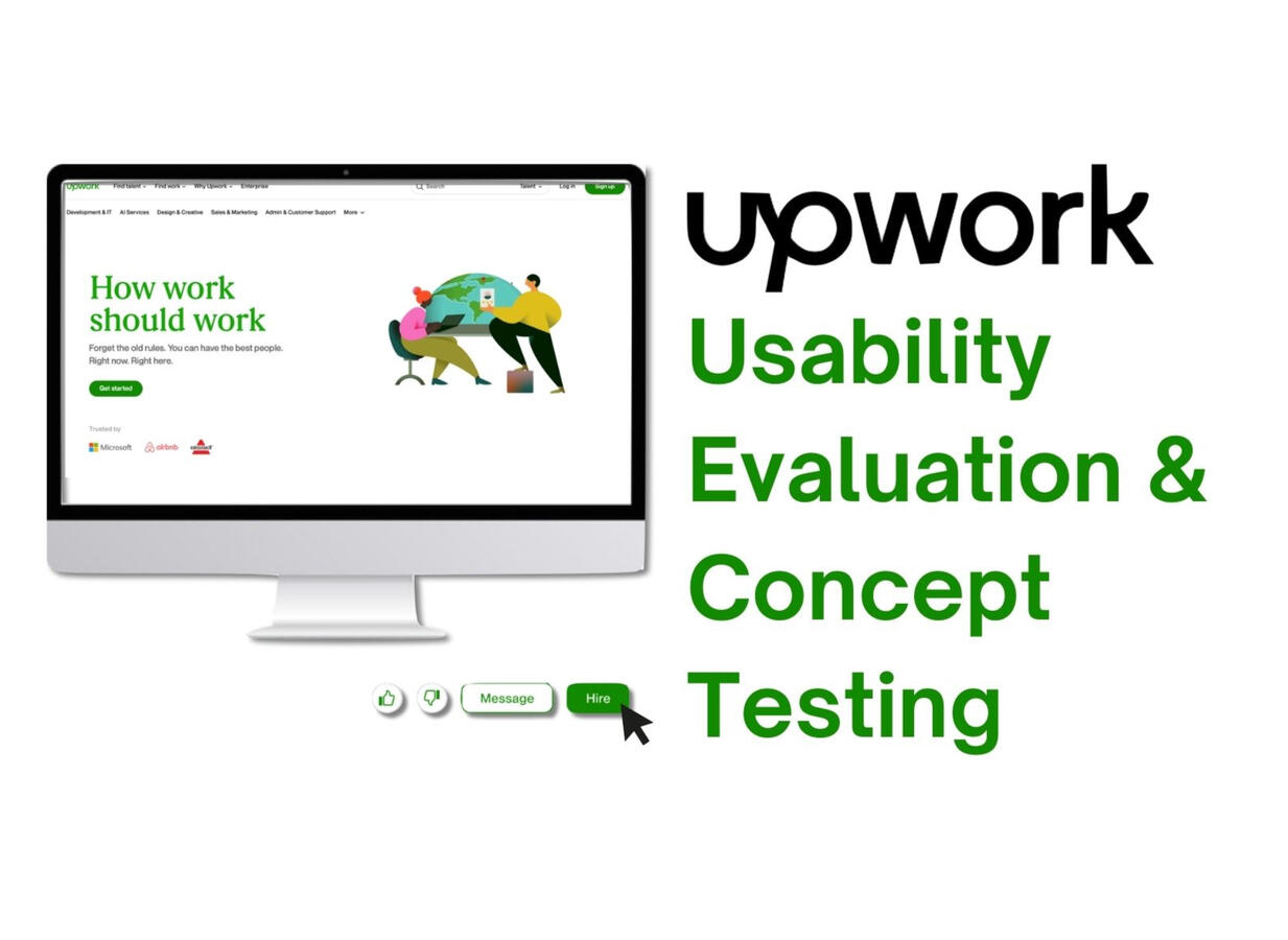
Upwork Case Study
Upwork: Logged Out Search & Browse Usability & Concept Testing
Role/Contribution: UX Research Consultant
Team & Stakeholders:
• UX Research Consultant (Myself)
• UX Research Consultants (2 peers)
• UX Research Consultant Manager
• Upwork Sr UX Researcher
• Upwork Product Manager
• Upwork Designers (2 peers)
Research Category: Evaluative
Project Type: Usability Study & Concept Testing
Timeline: May 2024 - June 2024 (7 Weeks)*
Skills Highlighted: Usability Testing, Concept Testing, Interview Moderating, Research Planning and Study Plan Writing, Qualitative Analysis, Key Insights Reporting
*The Logged Out Search & Browse project ran concurrently with the Shortlisting Tool project. Both projects took 7 weeks to complete.Please note: This project is protected by a Non-Disclosure Agreement (NDA). I have permission to showcase this project, but certain details are confidential. This case study is meant to highlight my research process for the Upwork projects. No confidential prototypes or assets were shared in this case study. For more details, please contact me.
Background
What is Upwork?
Upwork is the world’s largest work marketplace connecting businesses (clients) and independent talent (freelancers) around the world.
• Available on iOS, Android, Web Browser
• Present in 180+ countries
• 851,000 active clients in 2023
Problem Statement
Upwork wants to improve the new client onboarding experience when searching for and hiring freelancers.Upwork is seeking to understand if the addition of the listed features can facilitate an easier onboarding experience for new clients:
• Logged-out search & browse functionalities
• Generative AI to draft job posts from messages
• Streamlined payment flow
Research Goals
1. Learn about AI job post engagement
• How can Upwork encourage client behavior to use the generative AI job post in the Figma concept?
2. Identify friction points (if any) in the new client onboarding flow
3. Understand new client experience and compare the sentiments, confidence, and perception of the end-to-end new client experience of the existing live website vs. Figma concept
Key Insights
Summary
Please note: The content presented in this case study focuses on the general scope and outcomes without revealing sensitive insights or client information. For more details, please contact me.
Research Impacts
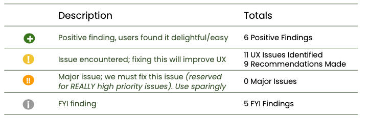
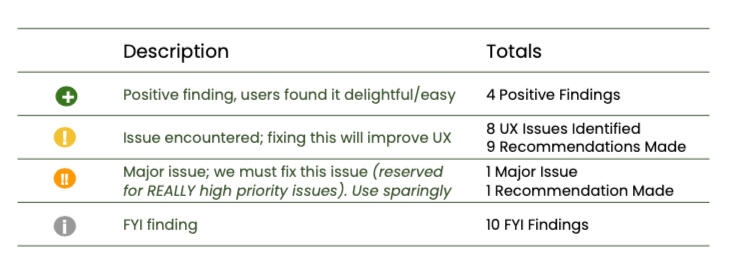
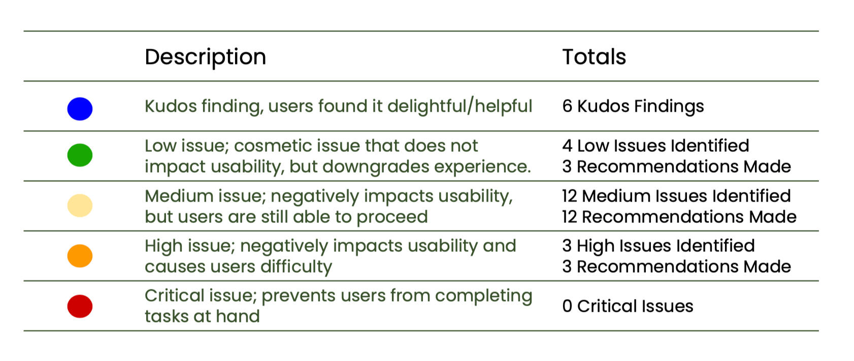
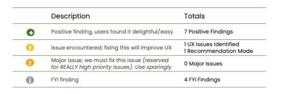
A matrix was used to organize and prioritize all findings from the research. The matrix helps identify aspects that are performing well, issues that need to be addressed and prioritized based on severity, and interesting observations from the study.Based on the research, 11 issues were identified. Our team provided Upwork with 9 actionable recommendations that the Upwork Product and Design teams considered to make iterations on the prototype for future additional concept testing.
Were the Research Goals Met?
| Research Goals | Research Impact | Goal Met? |
|---|---|---|
| 1. Learn about AI job post engagement | Reactions towards the AI job post helped inform user expectations around AI in the hiring process and shaped UX recommendations. | Accomplished |
| 2. Identify friction points (if any) in the new client onboarding flow | Common themes around confusing elements shown in the hiring processes shaped recommendations for the team. | Accomplished |
| 3. Understand new client experience and compare the sentiments, confidence, and perception of the end-to-end new client experience of the existing live website vs. Figma concept | Detailed user feedback provided team with an understanding of the best aspects facilitating a positive hiring experience between the live website and the Figma concept. | Accomplished |
Research Limitations
The participants were anchored to Sending a Message as a core step to using Upwork (pictured in step 3 of the Live Website Experience below).The research was not facilitated in a way for participants to explore alternative work flows. All participants were walked through the same steps to complete the hiring activity. As a result, there is no insights or user feedback about alternative work flows.
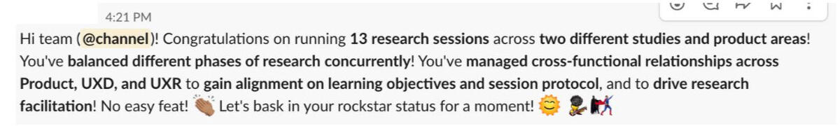
Stakeholder Feedback
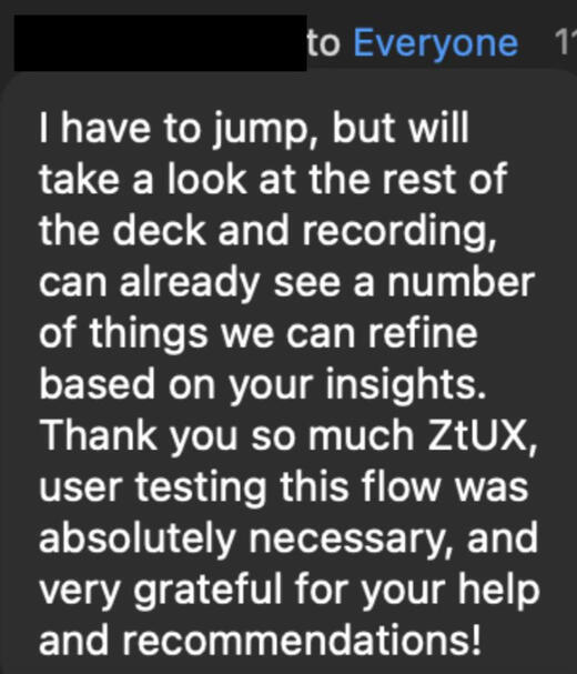
Pictured below is feedback from the Upwork team on my personal moderation style from the research phase of the project as well as positive reactions from Upwork stakeholders during the research readout.


Methodology
Approach
• Moderated interviews with usability and concept testing
• Within-subjects experiment (AB-BA-AB...sequence) between website and Figma concept
• 5 participants*
The decision to have a moderated study was made so participants could have a researcher available for questions, or so that the researcher could delve deeper into given responses if deemed necessary. Participants were randomly given either the live website or the Figma concept first ("AB-BA..." sequence) to minimize response variability.*Given timeline and budget, 6 participants were allocated to this research, but one participant was no longer considered in the final data since they misrepresented in the screener.
Participant Profile
• Prospective clients that have never made Upwork accounts and are interested in hiring
• Hiring/searching for virtual assistants, or web developers
The research objectives centered around learning a new client's experience with hiring on Upwork, so participants who have never hired on Upwork before would fit the scope of this project.Limiting the study participants to those hiring virtual assistants or web developers helped the Design team prepare the Figma concept for a realistic hiring experience.
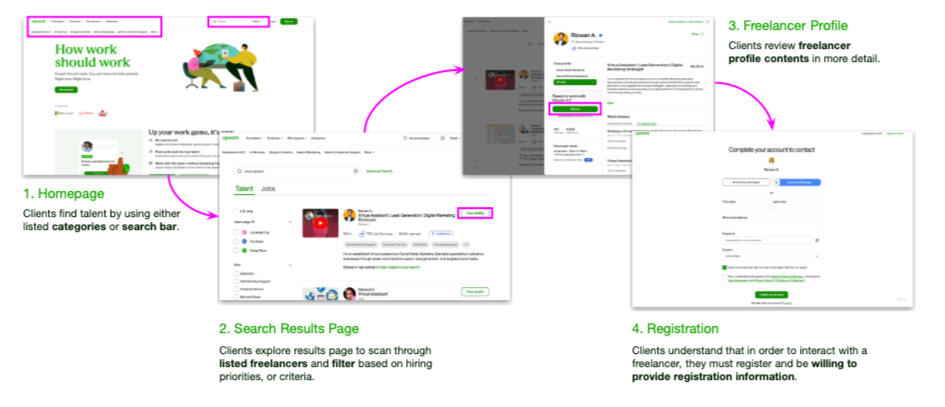
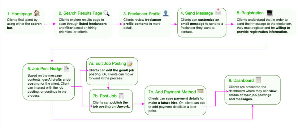
Live Website Experience
Participants were asked to visit the Upwork website and given scenario-based activities to complete. The activities along with scaled questions determined how effective each element supported client hiring efforts.Scenario Description: "Imagine you're looking to hire a virtual assistant and Freelancer XYZ seems like a great match. Walk us through what you would do next."Scaled Questions:
"On a scale of 1 to 7, with 7 being the highest, how...
• likely or unlikely are you to ...?"
• easy or difficult was ...?"
• helpful was the feature ...?"

Walkthrough of the Live Website Experience shown to participants
Figma Concept Experience
Similar to the live website experience, participants were also shown the Figma concept and given scenario-based activities to complete. The activities along with scaled questions determined how effective each element supported client hiring efforts.Scenario Description: "Imagine you're looking to hire a virtual assistant. Imagine Freelancer XYZ seems like a great match. Walk us through what you would do next."Scaled Questions:
"On a scale of 1 to 7, with 7 being the highest, how...
• likely or unlikely are you to ...?"
• easy or difficult was ...?"
• helpful was the feature ...?"

Walkthrough of the Figma Concept Experience shown to participants
*Visuals are not from the actual Figma concept presented to participants.
Reflection & Learnings
1. Keep the Conversation Going
During the moderation sessions, I learned when a participant mentions something interesting, or could expand on a point they made, it pays off to probe a tad deeper. Asking them to elaborate could uncover key findings that align with the research and business objectives!Other times, the discussion could be refocused back to the topics covered in the study guide. Being aware of how much time is left in the session helps me keep the conversation on track.2. Prioritize the Research Objectives
The new Figma concept had our stakeholders super curious about how participants would react to the new screens/buttons. While these impressions and user feedback is important, our research team wanted to ensure that the original questions were addressed for the team. Findings about the interface were supplementary to the overall takeaways.
Upwork: Shortlisting Tool Usability & Concept Testing
Role/Contribution: UX Research Consultant
Team & Stakeholders:
• UX Research Consultant (Myself)
• UX Research Consultants (2 peers)
• UX Research Consultant Manager
• Upwork Sr UX Researcher
• Upwork Product Manager
• Upwork Designers (2 peers)
Research Category: Evaluative
Project Type: Concept Testing
Timeline: May - June 2024 (7 Weeks)*
Skills Highlighted: Concept Testing, Interview Moderating, Research Planning and Study Plan Writing, Qualitative Analysis, Key Insights Reporting
*The Shortlisting Tool project ran concurrently with the Logged Out Search & Browse project. Both projects took 7 weeks to complete.Please note: This project is protected by a Non-Disclosure Agreement (NDA). I have permission to showcase this project, but certain details are confidential. This case study is meant to highlight my research process for the Upwork projects. No confidential prototypes or assets were shared in this case study. For more details, please contact me.
Background
Problem Statement
At the time of this project, only 23.5% of job posters used the shortlisting feature* in their hiring process. 8.5% of first time job posters used shortlisting tools on Upwork.Internal qualitative studies showed that the main reason Upwork clients don’t make hires is because they have trouble narrowing down freelancer applicants.Upwork wants to improve the visibility of the shortlist feature and improve clients’ understanding of the shortlist feature to make hiring easier.
*Shortlisting is a feature Upwork provides clients to narrow down a list of freelancer applicants by “Shortlisting” freelancer profiles (adding to hiring consideration) or “Archiving” (removing from hiring consideration) freelancer profiles.
Research Goals
1. Evaluate Job Proposal Layouts
• Which job proposal layout best helped clients narrow down their applicants?
2. Understand client comprehension of iconography
3. Gauge if clients can easily identify the shortlisting tools and understand their functions.
4. Pinpoint Friction Points
• Are there any points in the process that could be streamlined, or clearer for clients?
Key Insights
Summary
Please note: The content presented in this case study focuses on the general scope and outcomes without revealing sensitive insights or client information. For more details, please contact me.
Research Impacts
A matrix was used to organize and prioritize all findings from the research. The matrix helps identify aspects that are performing well, issues that need to be addressed and prioritized based on severity, and interesting observations from the study.Based on the research, 9 issues were identified. Our team provided Upwork with 11 actionable recommendations that the Upwork Product and Design teams could consider when making iterations on the prototype for future additional concept testing.
Were the Research Goals Met?
| Research Goals | Research Impact | Goal Met? |
|---|---|---|
| 1. Evaluate Job Proposal Layouts | Participants revealed key signals they rely on when making hiring decisions. These findings shaped recommendations for the job proposal layout to improve the client hiring experience. | Accomplished |
| 2. Understand client comprehension of iconography | Participants demonstrated their mental models around iconography and available features. This knowledge was shared with Upwork and usability recommendations were made to improve the experience. | Accomplished |
| 3. Gauge if clients can easily identify the shortlisting tools and understand their functions. | Participants explained how they use available shortlisting tools during their hiring process which was new information for the Upwork team. | Accomplished |
| 4. Pinpoint Friction Points | Participants voiced usability issues that were experienced during the study. These conversations helped shape recommendations for future concepts. | Accomplished |
Research Limitations
Participants all started the study with the task of reviewing job applicant proposals via the list view or table view layout. The study was not facilitated in a way that explored other activities or work flows to complete a hiring. As a result, the findings of this research is limited to the scope that participants experienced in the research.
Stakeholder Feedback
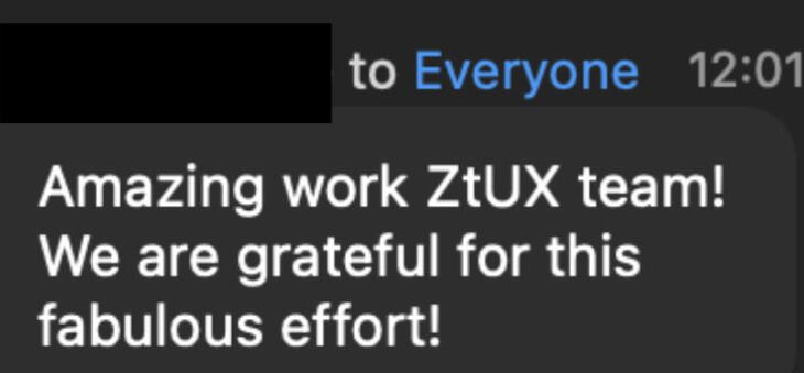
The research gathering phase of the Shortlisting Tool project wrapped up shortly after the Logged Out Search & Browse project. Pictured below is feedback from an Upwork stakeholder about the team's contribution for both projects thus far.
Methodology
Approach
• Moderated interviews with concept testing
• Within-subjects experiment (AB-BA-AB...sequence) between website and Figma concept
• 8 participants
The decision to have a moderated study was made so participants could have a researcher available if technical questions came up and so that the researcher could delve deeper into participant responses if deemed necessary. Participants were randomly given either the live website or the Figma concept first ("AB-BA..." sequence) to minimize response variability.Given the timeline and budget for this project, we were able to interview with 8 participants. Based off of Jacob Nielson's guidelines, 5-8 participants would be sufficient to uncover majority of usability issues. Another key indicator that the participant sample is sufficient is that we'll start to hear the same themes and patterns arise from the 8 participants. If this is not the case, then it would benefit the team to review the participant pool and determine if there is further participant segmentation that could occur.
Participant Profile
Split between clients who:
• Posted a job in the last 4-5 days but never hired
• Posted a job in the last 4-5 days and hired at least once in the last monthClient spending criteria in the last few weeks:
• Clients that spent <$1000
• Clients that spent <$1000
• Clients that spent >$1,500 in the past 28 days
To help clients narrow down job applicants, the research focused on clients with different budgets and hiring activity, not industry. Screening for participants with diverse budgets and hiring activities helped us learn from the clients that we are trying to assist the most.
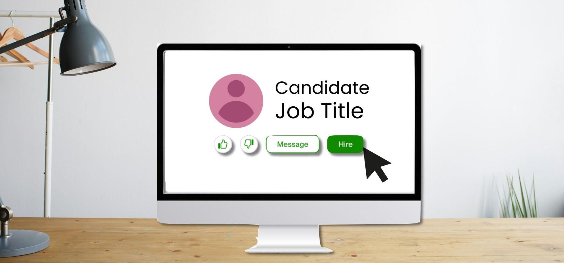
List View & Bulk Action Shortlisting Concept
Participants were interviewed about their typical hiring processes and then given a link to a Figma concept showing job applicants in a list as well as a bulk shortlisting tool feature. Participants were tasked with the activity to narrow down the list of applicants and given scaled questions to answer based on their experience.The activity along with scaled questions determined how effective the layout and the shortlisting tool supported client hiring efforts.Scenario Description: "Imagine you posted a job a few days ago and came back to review the pool of job applicants. Walk us through how you would narrow down your options to hire."Scaled Questions:
"On a scale of 1 to 7, with 7 being the highest, how...
• likely or unlikely are you to ...?"
• satisfied or dissatisfied are you with ...?"
• helpful was the feature to...?"

Example of List View & Bulk Action concept
*Visuals are not from the actual Figma concept presented to participants.
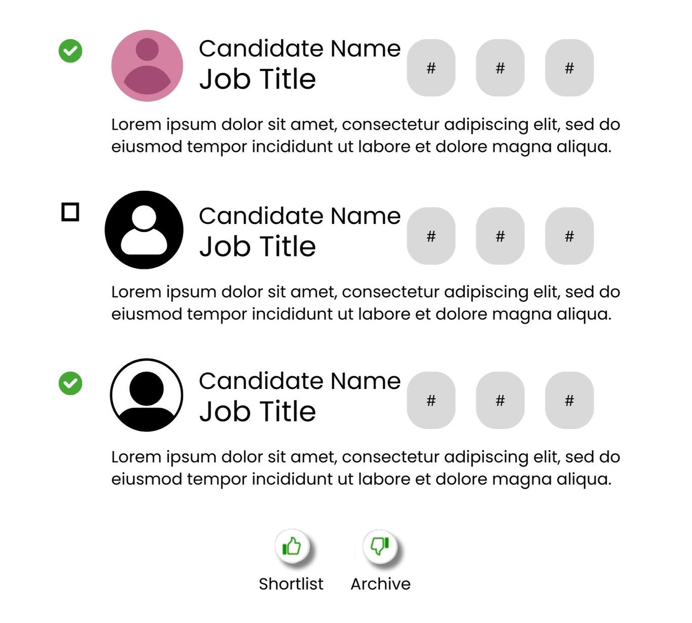
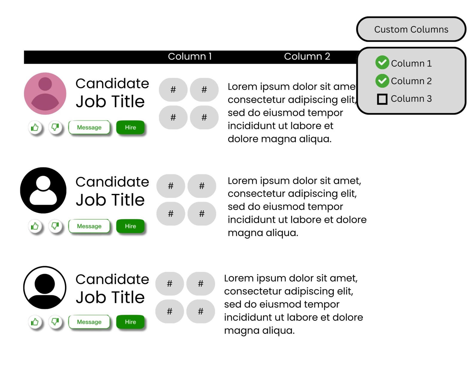
Table View & Custom Columns Concept
Participants were interviewed about their typical hiring processes and then given a link to a Figma concept showing job applicants in a table as well as a custom column feature. Participants were tasked with the activity to narrow down the list of applicants and given scaled questions to answer based on their experience.The activity along with scaled questions determined how effective the layout supported client hiring efforts.Scenario Description: "Imagine you posted a job a few days ago and came back to review the pool of job applicants. Walk us through how you would narrow down your options to hire."Scaled Questions:
"On a scale of 1 to 7, with 7 being the highest, how...
• likely or unlikely are you to ...?"
• satisfied or dissatisfied are you with ...?"
• helpful was the feature to...?"

Example of Table View & Custom Columns concept
*Visuals are not from the actual Figma concept presented to participants.
Reflection & Learnings
1. Additional Questions? More Research Opportunities!
While I was doing data analysis, I noticed that I had more followup questions to the common themes and patterns that were appearing. While I shared these thoughts with the team and stakeholders, if given the time and budget, it would be interesting to see how we could build on this project and conduct follow-up studies.2. Team Communication is So Valuable
The readout for this project was initially scheduled for the day after another Upwork project readout. Our team agreed that we would like more time to finalize all deliverables before presenting, so we communicated in advanced with the Upwork team to reschedule the readout to a later date. Doing so allowed our team the time needed to deliver our findings in a quality manner.Additionally, a fellow team member had to step away from the project for a long period due to personal matters. Staying in contact with the team member helped everyone get a feel for bandwidth and reallocate remaining tasks to the other team members. Most importantly, we're all people at the end of the day, and it's kind to check in with others!
Visa Case Study
Visa: Tap to Add Card - Merchant Card on File Concept Testing

Photo by Julio Lopez on Unsplash

Role/Contribution: Design Researcher
Team & Stakeholders:
• Design Researcher (Myself)
• Sr Design Researcher
• Design Researcher
• Sr Product Manager
• Product Manager
• Lead Designer
• Sr Designer
Research Category: Generative
Project Type: Concept Testing
Timeline: November 2024 - March 2025
Skills Highlighted: Concept Testing, Research Planning and Study Plan Writing, Interview Moderating, Qualitative & Quantitative Analysis, Key Insights Reporting
This case study is meant to showcase the research process for the Visa projects. Visuals shown are to help illustrate the process. No confidential prototypes or assets were shared in this case study. For more details, please contact me.
Background
What is Tap to Add Card?
Visa’s Tap to Add Card offers cardholders a secure method of saving payment information by tapping their payment card to their smartphone. The tap creates a token (unique, randomly generated identifier) of the card credentials so that the actual card details are never exposed or shown during transactions. Tap to Add Card also removes the need for manual data entry or taking a picture of the payment card when adding card details.This study focused on the use case of Tap to Add Card in the scenarios of consumers saving cards on file within merchant apps.
Problem Statement
Visa’s Tap to Add Card team seeks to understand the consumer landscape around saving cards on file and gather user feedback on the Tap to Add Card - Merchant Card on File experience.
Business Objectives
1. Understand why Tap to Add Card - Merchant Card on File is a good idea for Visa to pursue and implement.
2. Gather user feedback to design and refine the Tap to Add Card - Merchant Card on File experience.
Research Objectives
1. Understand consumer behaviors, sentiments, and motivations around adding and saving cards on file in merchant apps.
2. Investigate expectations around the process to saving a card on file.
3. Uncover sentiments around preferences, security, the impact of physically tapping cards, and the Visa brand.
4. Use learnings to inform and build the experience, value proposition, and UX guide for Tap to Add Card - Merchant Card on File.
Key Insights
Summary
Please note: The content presented in this case study focuses on the general scope and outcomes without revealing sensitive insights or company information. For more details, please contact me.
Research Impact
| Category | Objectives | Research Impact | Goal Met? |
|---|---|---|---|
| Business | 1. Understand why Tap to Add Card - Merchant Card on File is a good idea for Visa to pursue and implement. | User feedback revealed the concept was well received and provided qualitative and quantitative data on why Tap to Add Card - Merchant Card on File is a valuable opportunity for Visa. | Accomplished |
| Business | 2. Gather user feedback to design and refine the Tap to Add Card - Merchant Card on File experience. | User feedback from the interviews helped shape design and product language iterations to prepare for future usability testing. | Accomplished |
| Research | 3. Understand consumer behaviors, sentiments, and motivations around adding and saving cards on file in merchant apps. | Based off of the moderated interviews and survey responses, participants revealed a few key consideration criteria they weigh when deciding how to proceed with saving or not saving their card details. | Accomplished |
| Research | 4. Investigate expectations around the process to saving a card on file. | The survey and moderated interviews highlighted overall consumer attitudes around payment decisions to save or not save cards on file. | Accomplished |
| Research | 5. Uncover sentiments around preferences, security, the impact of physically tapping cards, and the Visa brand. | The survey and moderated interviews highlighted overall consumer attitudes around decisions on saving or not saving cards on file. | Accomplished |
| Research | 6. Use learnings to inform and build the experience, value proposition, and UX guide for Tap to Add Card - Merchant Card on File. | Based off of user feedback with the concept, design and language recommendations were made to the Design and Product team to implement for future usability testing with users. | Accomplished |
Methodology
Approach
• 11 Moderated interviews on UserTesting with participants based in US, UK, Brazil
• Concurrent survey with 400 respondents from US, UK, Brazil
Tap to Add Card - Merchant Card on File will pilot in the US, UK, and Brazil during its launch, so this research prioritized learning from participants based in those countries. Additionally, it was valuable to the team to learn from people who actively save cards on file (n=8) and people who choose not to save cards on file (n=3) to get a holistic understanding of consumer sentiments and attitudes towards the concept.The survey was conducted at the same time as the moderated interviews and served to collect quantitative data around current consumer behaviors towards shopping on merchant apps and decisions around saving payment information.
Participant Criteria
People were eligible to participate in either the survey or the moderated interviews if they met the following criteria:
• Based in US, UK, Brazil
• Contactless card user
• Uses a merchant app or shopping app on their phone
• Fluent in English
• Over 21 years of age
• Has financial decision-making responsibility
The participant criteria was curated to hone in on the key people we wanted to learn from during the research. It was valuable to speak to individuals fitting these criteria because the product would be serving consumers familiar with contactless cards, shopping on apps, and making their own financial decision when it launched. The English language criteria was implemented since the research team worked in an English speaking capacity.
Process
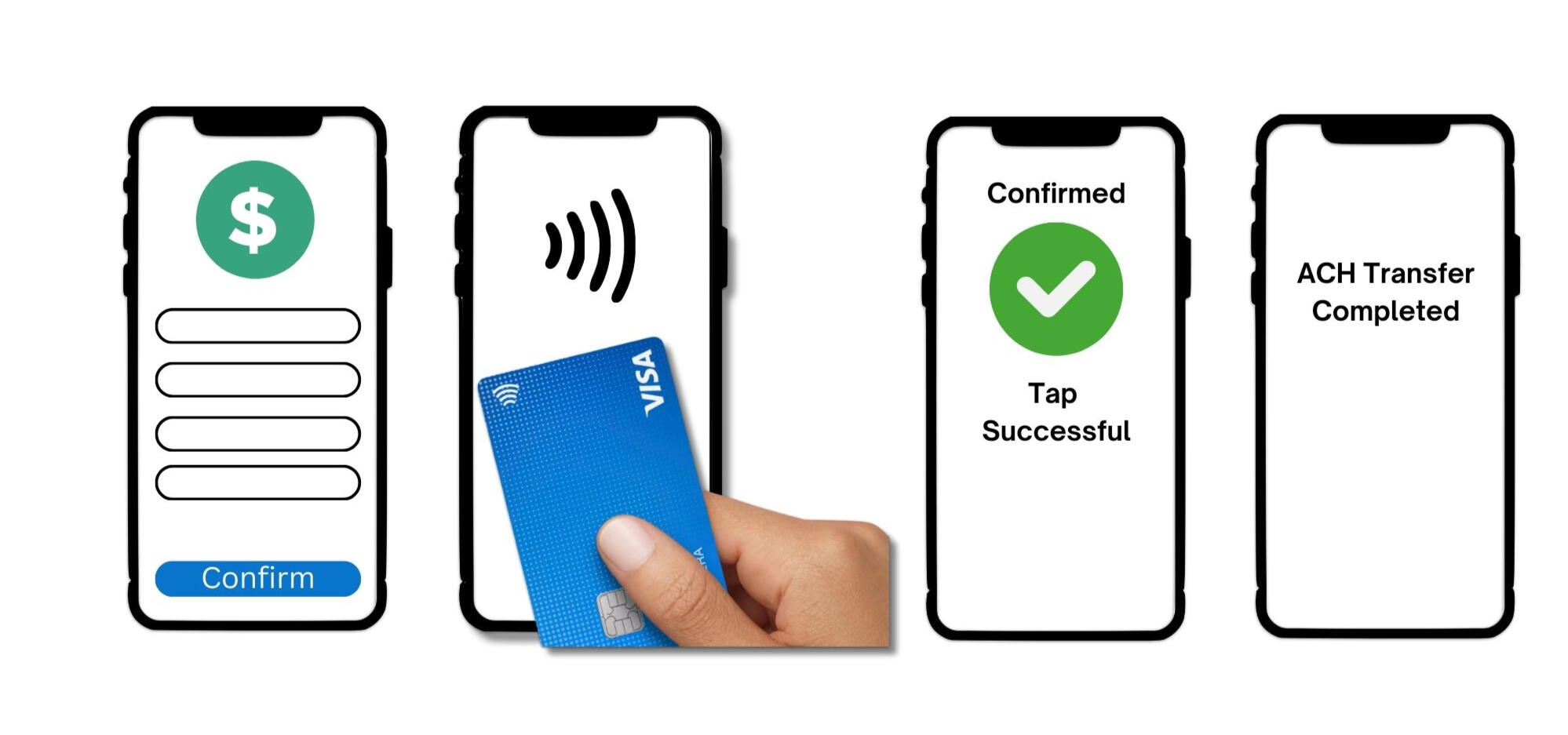
During the moderated interviews, participants would be asked about their current phone shopping behaviors and their experiences with saving a card on file within an app.After the informative discussion, participants were shown a prototype where a card was being tapped to save it on file within the shopping app. Participants were asked about their thoughts and feedback on the concept.
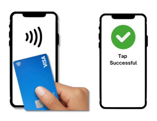
Participants were shown a person tapping their card to their phone and having the card details saved.
Not from actual concept.
Reflections & Learnings
1. Figure out the the bigger picture
When collecting data between multiple sources of information, it is important to see where data points connect. For example, I would synthesize the qualitative responses that were provided from the moderated interviews and see where those key insights aligned (or offered a different perspective) with the quantitative data from the survey.2. Create deliverables that exist beyond me.
I worked with two superstar researchers that stressed the importance of creating a comprehensive readout that could be used at the company even after our time on the project.This means being meticulous about each detail so that everything can be referenced back to the source and so that the audience reading the information can clearly understand the thought process behind each step in the process.
Visa: Tap to Confirm Rapid Iterative Testing/Evaluation (RITE)

Role/Contribution: Design Researcher
Team & Stakeholders:
• Design Researcher (Myself)
• Sr Design Researcher
• Design Researcher
• Sr Product Manager
• Sr Product Manager
• Product Manager
• Lead Designer
• Sr Designer
Research Category: Evaluative
Project Type: Rapid Iterative Testing Evaluation (RITE) Usability & Concept Testing
Timeline: November 2024 - March 2025
Skills Highlighted: Usability & Concept Testing, Research Planning and Study Plan Writing, Interview Moderating, Qualitative Analysis, Key Insights Reporting
This case study is meant to showcase the research process for the Visa projects. Visuals shown are to help illustrate the process. No confidential prototypes or assets were shared in this case study. For more details, please contact me.
Background
What is Tap to Confirm?
Visa’s Tap to Confirm allows consumers to quickly and securely authenticate their identity by tapping their payment card to their smartphone during the following scenarios:
• Activating a new card
• Changing personal information within their banking app (like address)
• Making a high value ACH (automated clearing house) transfer of money
Problem Statement
Visa’s Tap to Confirm team seeks to understand the consumer landscape around card activation and authentication and gather user feedback on the Tap to Confirm experience.
Business Objectives
1. Refine the Tap to Confirm experience based on user feedback
2. Provide stakeholders and business partners with a comprehensive UX guide for the Tap to Confirm experience
Research Objectives
1. Evaluate consumer understanding of the end-to-end Tap to Confirm experience
2. Identify opportunities to improve the existing experience
3. Utilize learnings to inform UX guides and recommendations for the team
Key Insights
Summary
Please note: The content presented in this case study focuses on the general scope and outcomes without revealing sensitive insights or company information. For more details, please contact me.
Research Impact
Important issues were identified based on the feedback from the 24 participants. Based on the feedback received, recommendations were provided to the Design team to address in the concepts prior to round 2 of RITE testing.
| Category | Objectives | Research Impact | Goal Met? |
|---|---|---|---|
| Business | 1. Refine the Tap to Confirm experience based on user feedback | User feedback revealed 19 usability issues ranging in severity. Based on the feedback, design and language recommendations were provided to improve the existing concepts for future tests. | Accomplished |
| Business | 2. Provide stakeholders and business partners with a comprehensive UX guide for the Tap to Confirm experience. | Round 1 of the RITE usability testing has been completed and recommendations to improve the concept for round 2 of testing has been provided to the team. Once round 2 is complete, the Design and Product team will have all the assets and data needed to provide stakeholders with a comprehensive UX guide. | In Progress |
| Research | 3. Evaluate consumer understanding of the end-to-end Tap to Confirm experience | Participants understood and engaged with all concept scenarios and provided key insights into their expectations and impressions of each concept. | Accomplished |
| Research | 4. Identify opportunities to improve the existing experience | 19 usability issues ranging in severity were identified. Based on participant feedback, design and language recommendations were provided to improve the existing concepts for future tests. | Accomplished |
| Research | 5. Utilize learnings to inform UX guides and recommendations for the team | Participant feedback was valuable in shaping concept recommendations. After round 1 is complete, the design and product team have the data the need to make concept iterations, but the completed UX guide will be prepared after all findings from round 2 are completed. | In Progress |
Methodology
Approach
Prior research was conducted to gather information on consumer behaviors, sentiments, and attitudes related to card activations and issuer authentications. This research will focus on RITE usability testing as a means to get feedback on the Tap to Confirm experience.This case study is focused solely on the process and findings related to Round 1 of the RITE usability testing. All the usability test sessions were unmoderated.
| Unmoderated Usability Scenario | Round 1 Testing | Design Updates | Round 2 Testing |
|---|---|---|---|
| •Activating a new card •Update personal information in bank app • Complete ACH (automated clearing house) transfer of money | 24 participants (8 from each country) | Design Team to make updates as needed | 18 Participants (6 from each country) |
The US, UK, and France were the pilot countries for the Tap to Confirm experience, so it was important to learn from people based in those countries.The concepts for each scenario were already built out and ready for participants to interact with on UserTesting. Additionally, this study focuses on identifying potential design improvements, so an unmoderated recorded usability session where participants can provide their impressions of the concept made the most sense given the resources available and the volume of participants needed for the study.
Participant Criteria
People were eligible to participate in either the survey or the RITE usability tests if they met the following criteria:
• Based in US, UK, France
• Contactless card user
• Have activated a new card in the last year
• Use a banking app on their phone
• Use a mix of their digital wallet and another option
• Fluent in English
• Over 21 years of age
• Has financial decision-making responsibility
The participant criteria was curated to hone in on the key people we wanted to learn from during the research. It was valuable to speak to individuals fitting these criteria because the product would be serving consumers in the specified regions who are familiar with contactless cards, digital banking, and making their own financial decision when it launched. The specific scenario criteria of using banking apps, digital wallets, or recently activating a new card was important so that participants could compare the Tap to Confirm flow with a recent experienced scenario.
The English language criteria was implemented since the research team worked in an English speaking capacity.
Process
The 24 participants (n=8 US, n=8 UK, n=8 France) were screened and before being given the unmoderated usability test on UserTesting. The participants started off with reviewing concepts for the following three scenarios in a randomized order:
• Update personal information within a banking app
• Activate a new card
• Authenticate prior to completing a high value ACH transfer
The scenarios were ordered randomly so that participants would avoid giving responses anchored on a particular experience. Participants would engage with the three concepts while answering the questions provided by the research team.

Participants were shown a concept of an ACH transfer scenario
Not from actual concept.
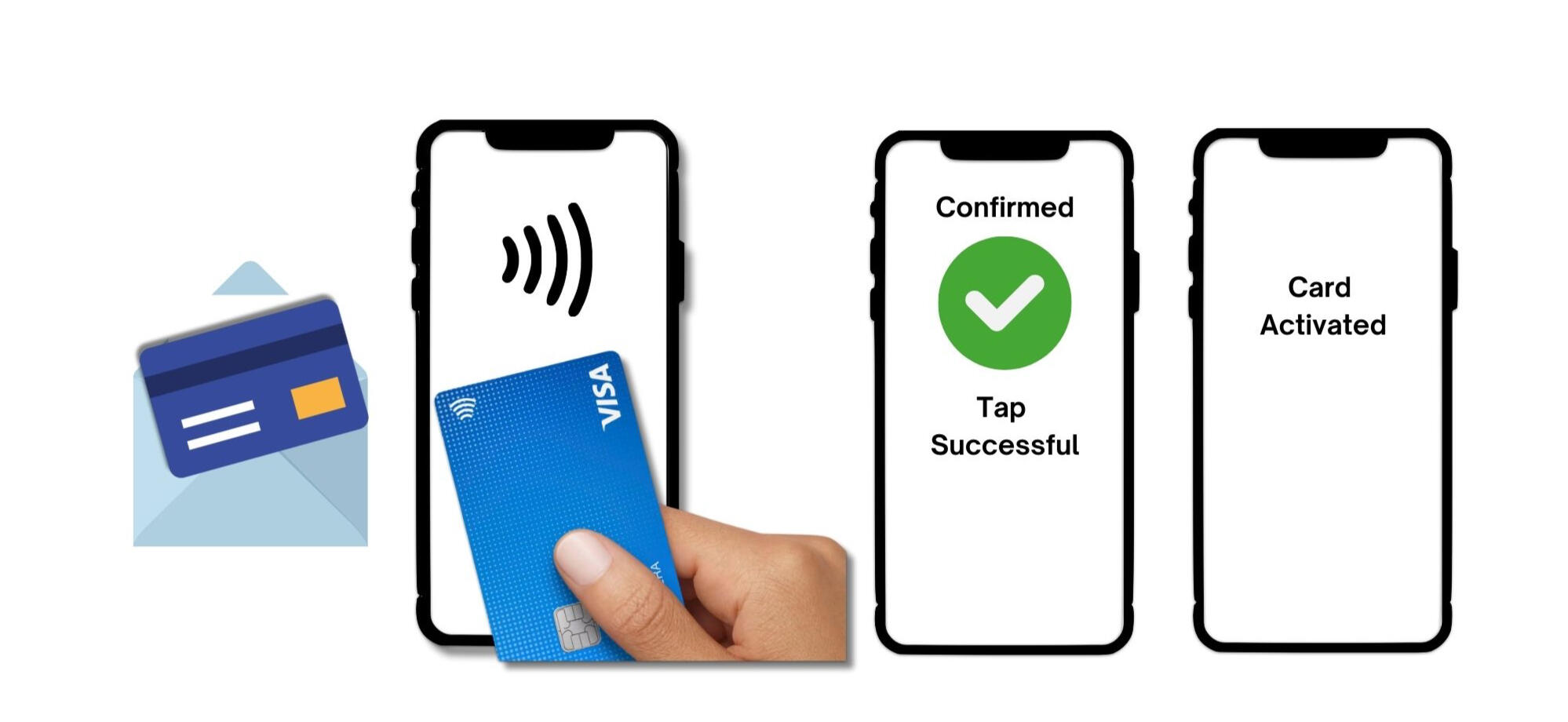
Participants were shown a scenario to activate a new card in the mail by tapping.
Not from actual concept.
Next Steps
After receiving the findings from round 1 of the RITE usability study, the Design team is accountable to make the necessary revisions to the concepts prior to launching recruitment for round 2.After conducting the first round of the study, the research team identified parts in the usability test that could be condensed and will be making the necessary revisions in UserTesting prior to launching the study again for round 2.
Reflections & Learnings
1. Be Mindful of Participants' Time!
Participants were shown three concept flows and many sessions took over 40 minutes. While participants were informed that this session would run long prior to starting the study, it is still important to fairly reward the participants for their time and extra time spent.To prevent future studies from running long, a concise scope of content and key questions should be given to participants to ensure that people are thoroughly engaged with their responses.
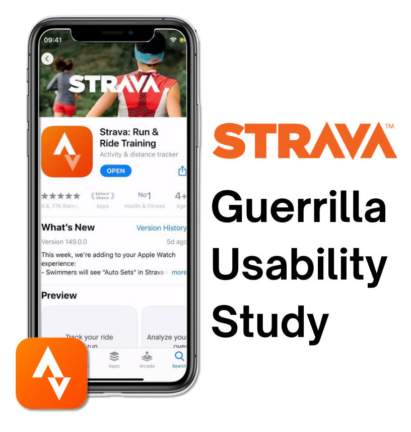
Strava Case Study
Strava Guerrilla Usability Study
Role: Primary UX Researcher
Timeline: February - March 2024 (4 Weeks)
Research Category: Evaluative
Project Type: Usability Testing
Skills Highlighted: Guerrilla Usability Study, Research Planning and Study Plan Writing, Qualitative Analysis, Key Insights Reporting
Background
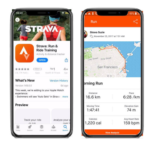
What is Strava?
Strava is a platform for recording physical activity using Global Positioning System data, allowing athletes to explore, connect, and measure progress.
• Released in 2009
• Available on iOS, Android, Web Browser
• Over 100 million athletes
• 195 countries
• 14 languages
• Offers over 30 types of activities to record
• Offers social networking features
Problem Statement
I seek to understand how new users navigate on Strava and identify usability opportunities that the Strava app could consider to facilitate an intuitive user experience for first time users.I love running, but when I attempted to try Strava for the first time before a run, I felt overwhelmed with the unfamiliar app. I just wanted to start running, not figure out the app. Strava lasted maybe 5 minutes on my phone before I deleted it out of frustration and resorted to my familiar fitness tracking app.
Research Goals
1. Understand how new users interact on the Strava app
• Gauging new users’ reported ease of use and impressions of app activities2. Identify is Strava app has areas of usability improvement for its offered app features:
• Tracking Physical Activity
• Reviewing activity
• Adding a friend
• Sharing activity with friends
Key Insights
Summary
Majority of Strava’s processes are intuitive for participants. Most participants were able to accomplish all activities presented to them in this study.Icons used on Strava are mostly recognizable and associated with their respective activity, but this is not the case for all icons.
• The share icon is universally recognized and associated with sending the selected details to another
• Most participants defaulted to the using the "+" icon as part of the process to add a friend
• The magnifying glass is associated with search, but it is not intuitive to all users to search a friend, or person up
→ Participants were familiar with the “+” icon and associated this with “adding” a friend. Consider matching icons to the relevant activity that users already have an association with. For example the “+” button to add a friend.Strava is seen as a social app.
• Participants highlighted the social aspects of the app such as the ability to add friends and compare workouts.
• Seeing their friends do their workouts, or accomplish personal records were seen as a motivating factor in the participant’s own personal fitness journey
Research Impacts
A matrix was used to organize and prioritize all findings from the research. The matrix helps identify aspects that are performing well, issues that need to be addressed and prioritized based on severity, and interesting observations from the study.Based on the research, a core issue with the "Adding a Friend" feature was identified. Based on participant feedback, I provided a recommendation that could be considered in future iterations of Strava.
Were the Research Goals Met?
| Research Goals | Research Impact | Goal Met? |
|---|---|---|
| 1. Understand how new users interact on the Strava app | Participants demonstrated how they engage with the app to complete each Strava activity given to them during the study. Through this engagement, it became clear how each app feature adds to the overall Strava experience for new users. | Accomplished |
| 2. Identify is Strava app has areas of usability improvement for its offered app features: • Tracking Physical Activity • Reviewing activity • Adding a friend • Sharing activity with friends | While participants completed most activities, it was clear that the "Adding a Friend" feature within the Strava app was not as intuitive as its other features. Few participants struggled and combed through the app to accomplish this activity and from user feedback, recommendations were made to address this feature in future Strava iterations. | Accomplished |
Methodology
Why a guerrilla usability study?
Participants had to walk around for one of the Strava activities, so an outside environment offered the best study experience. Additionally, given that I was the sole researcher for this project, recruiting, screening and engaging with participants out in public was the most feasible given the constraints of the project.
Approach
Participants would be screened to see if they would be a new Strava user. If this was true and they opted in to participate in the study, then the participant would be asked to download Strava on their device.After onboarding to Strava using a dummy account (to save time on registration), participants were given four activities to accomplish (as shown below).After completing the activities, participants were given reflection questions to discuss their impressions and experience with engaging with each activity.

Activities participants were asked to complete during the study

Logistics
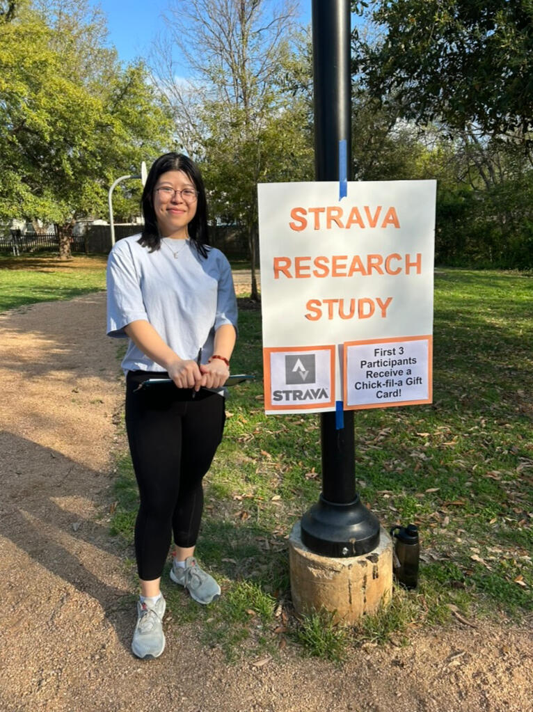
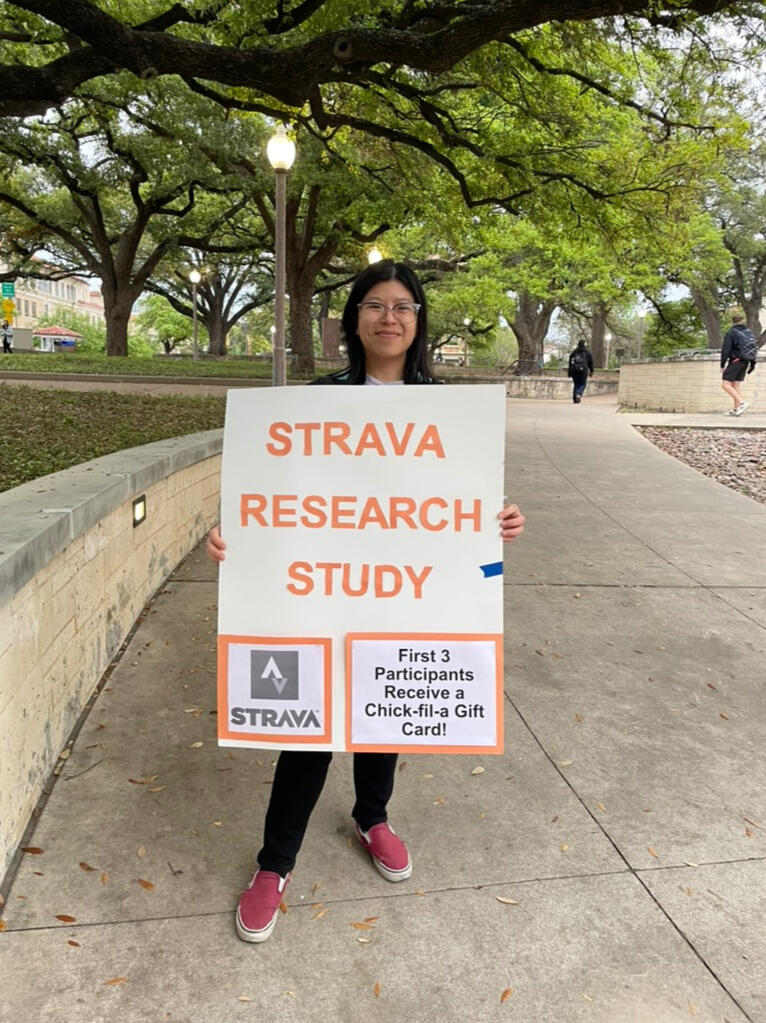
Initially, a local park was chosen to conduct research, but 0 people opted to participate. Considering it was a Wednesday evening, there was minimal foot traffic and perhaps people felt compelled to avoid the person with a clipboard (me).I decided to ditch my notes on the clipboard and pivot the research location to the university so that there would be ample foot traffic, which could increase my odds of recruiting new Strava users to the study. At the end of the two hours, five participants were successfully studied!

First attempt of research in the park

Conducting research at the University
Timeline
This study took place over 4 weeks, and the table below outlines key deliverables that were prepared during the course of the project.
| Date | Deliverable |
|---|---|
| February 18 | Plan and outline the study |
| February 20 | Get feedback on the study plan and make revisions |
| March 3 | Pilot session with UX Mentor |
| March 3-7 | Conduct guerrilla usability study in public |
| March 10 | Analyze feedback and organize findings |
| March 17 | Share key insights in class readout |
Reflections & Learnings
1. Preparation is Key
Being familiar with the questions helped me conduct the study in a smooth manner where I didn’t have to reference the discussion guide during the usability sessions. Additionally, preparing a dummy account saved people time on new user onboarding and we could jump right into the session.2. Having help, helps!
Inviting my friend along to document the research process and inform potential participants of the study while I was with prior participants made the process seamless.3. Consider having another researcher next time
In a place with heavy foot traffic, having another researcher to conduct the study could help bring in more responses. Additionally, it could reduce wait times for interested participants by having another researcher ready to start a study.